Reimagining campaign creation with a unified customer engagement platform
Flybits' marketing platform, Experience Studio, was losing traction due to fragmented workflows and dependency on Sales Engineers for campaign base setups. This friction didn't just slow marketers down but also limited the company's ability to scale its self-serve model – a key product strategy initiative.
I drove the redesign of Experience Studio to unify disjointed tools into a single, self-serve ecosystem that enabled marketers to independently build, personalize, and launch campaigns. The project wasn't only about enhancing usability but also aimed at improving the operational scalability – accelerating Flybits' path to product-market fit.
Outcomes
Unified platform with combined marketer + developer tools
Result: 75% reduction in campaign creation time for Marketers.
Impact: Marketers could independently launch personalized experiences at scale.
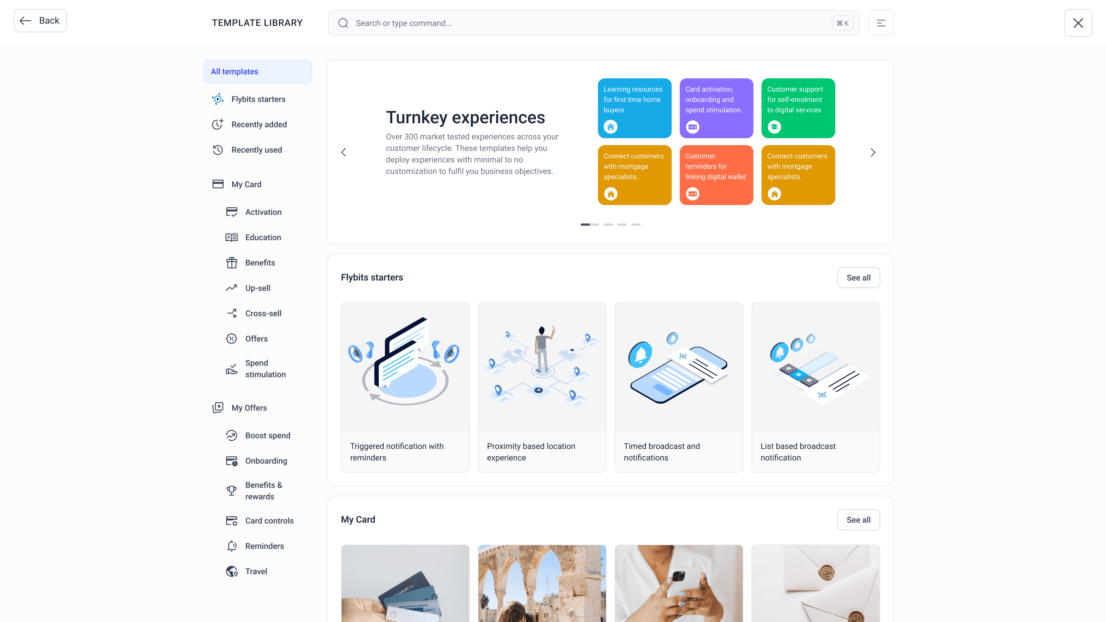
Redesigned Template Library and Experience Canvas
Result: 50% faster time-to-launch for customer engagement campaigns.
Impact: Accelerated go-to-market velocity with better platform usability
Streamlined API templates + access management tool
Result: 40 hours saved per deployment for Sales Engineers.
Impact: Sales Engineers could focus on higher-value initiatives
End-to-end usability validation with marketers + technical staff
Result: 90% NPS from internal and client-side users.
Impact: Improved adoption and engagement rates
Overall, it helped Flybits to transition from a service-heavy to a self-serve platform, supporting Flybits' SaaS growth strategy and improved the Product-market fit.
Approach
Process
Role
Product designer
Responsibilities
- Design concept solution
- Information architecture
- Facilitating design thinking workshops
- Functional requirements and user stories
- Design strategy
- Technical specifications
Team
Business analyst
Director of product
VPs of engineering
Engineers
Industry
Fintech, B2B SaaS
Project duration
2 months

Explored and tested low-fidelity wireframes to validate the widget configurations from a utilitarian perspective. A header with search and a side global navigation were used as they're conventional patterns.
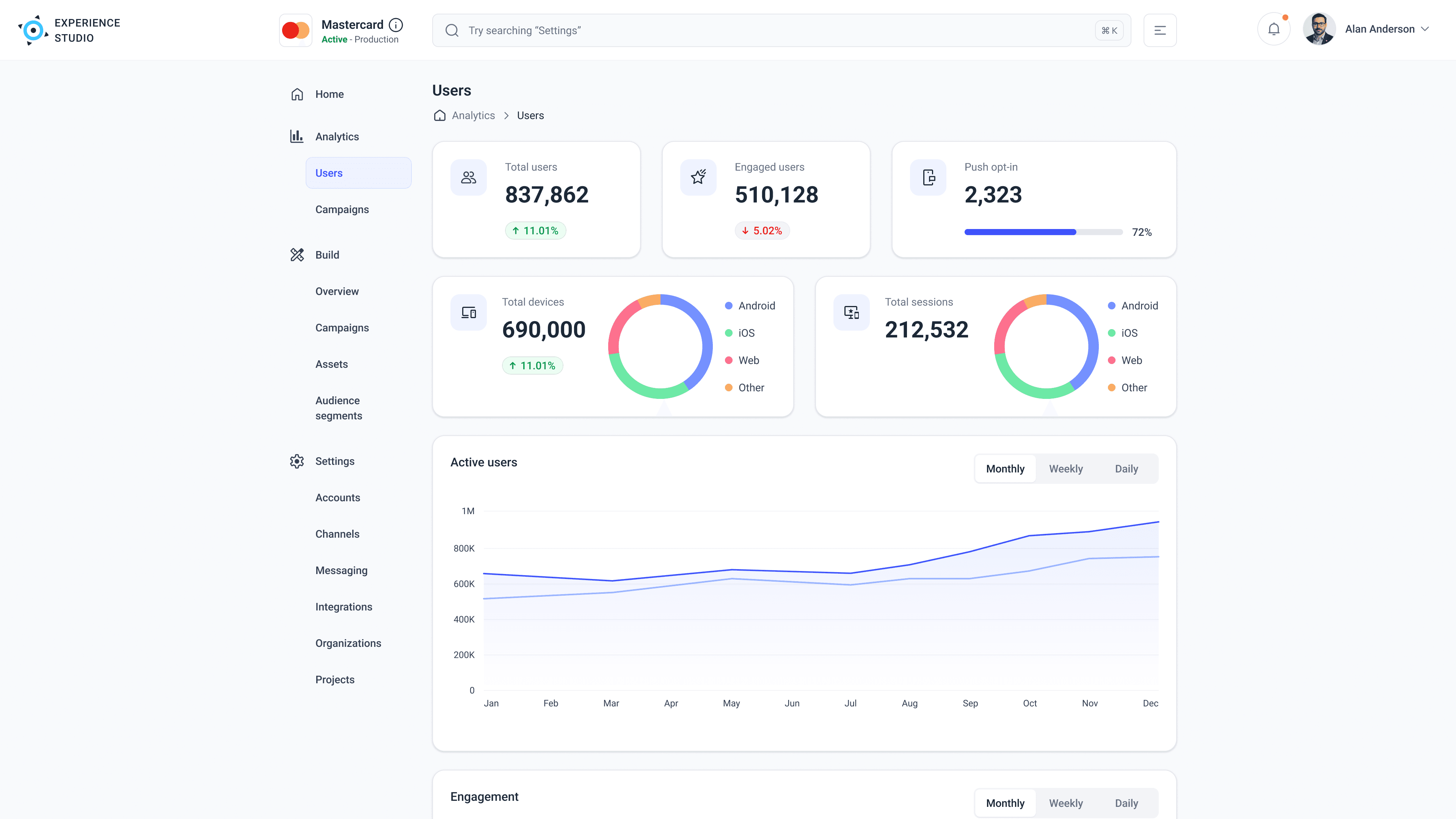
The analytics dashboard was lift and shifted, with a simple goal; clarity of information

Dashboard view
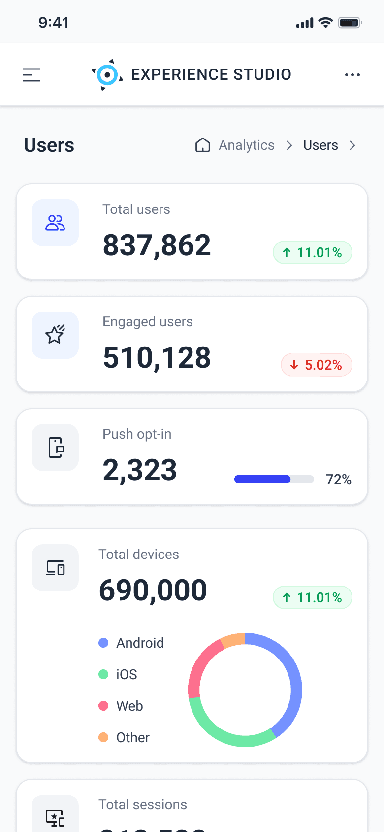
Analytics view
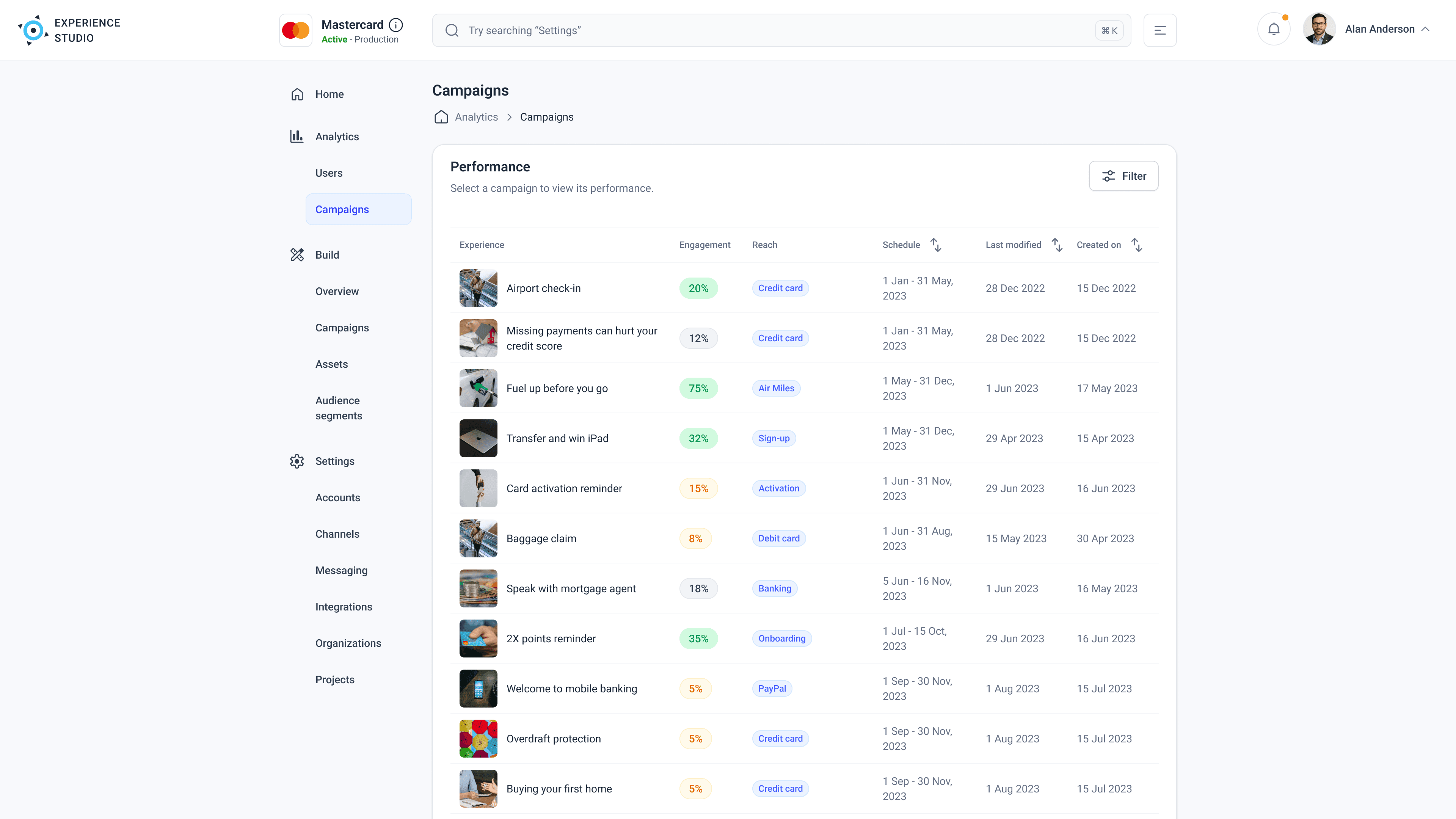
Live campaigns at a glance. Marketers could dive into the details of individual experiences and adjust AI/data personalization as per business needs

Starting point from where marketers could start creating building blocks of campaigns, alternatively drafts could be published or ongoing campaigns could be edited
Resolved fundamental usability issues and reorganized the layout as per Jakob's law
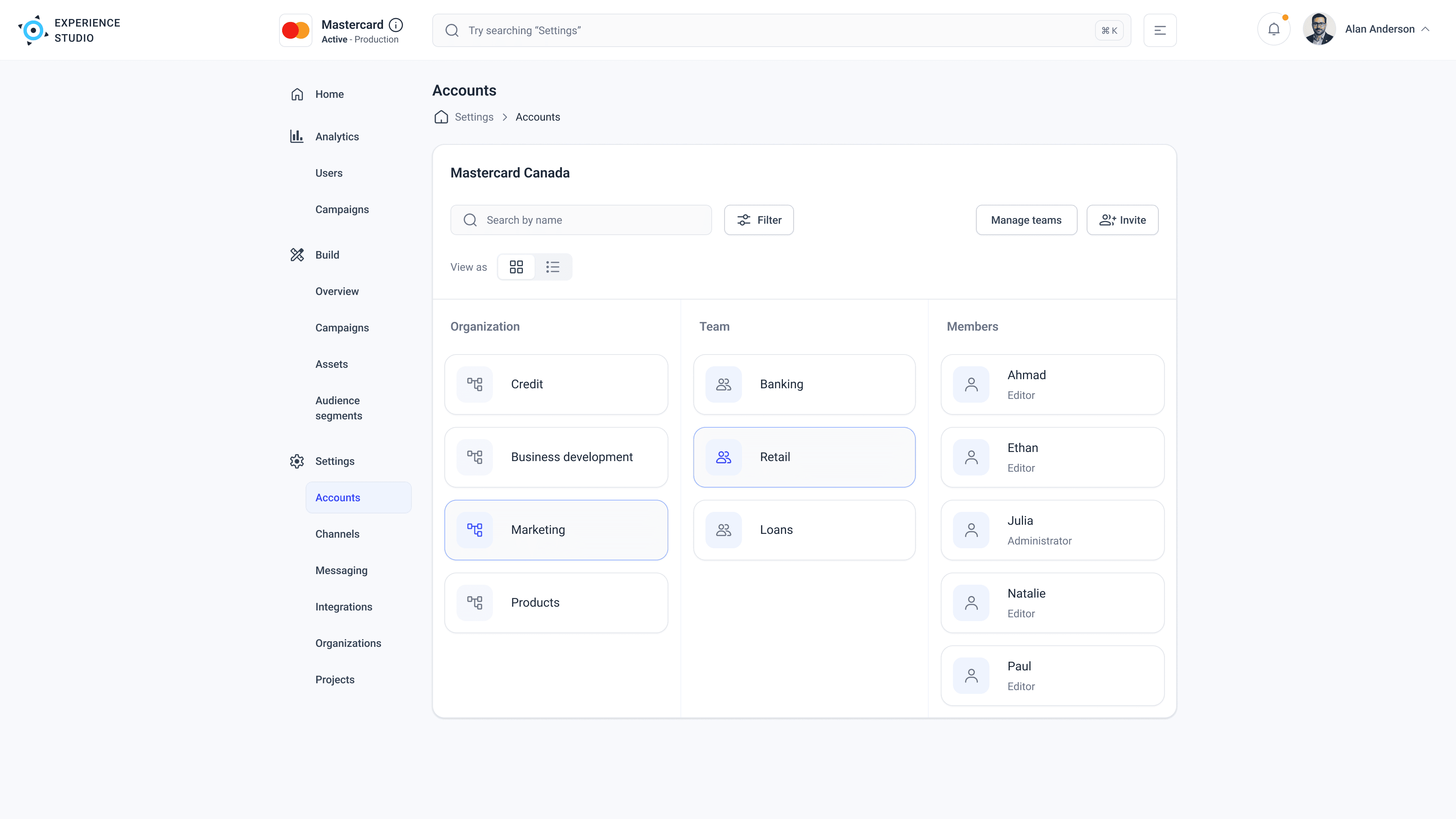
Account settings organized by organization, team, and member roles
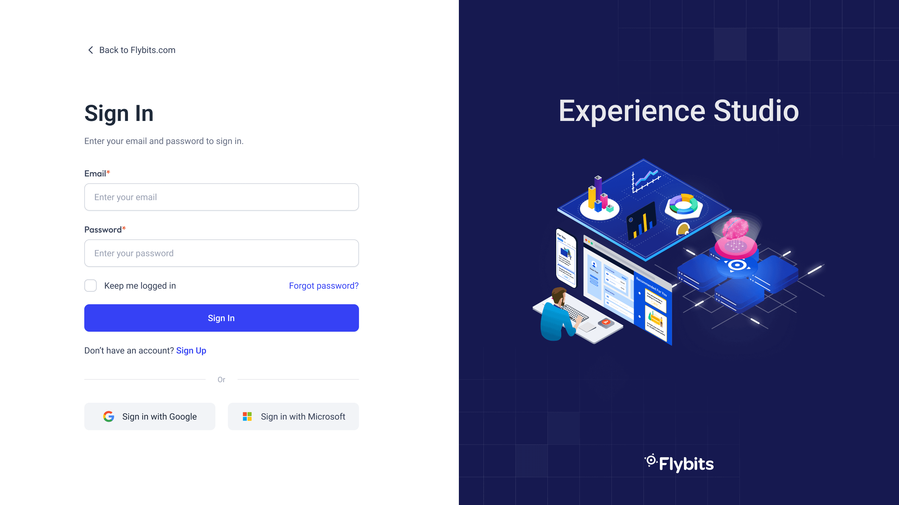
Refreshed log-in page repurposing the original illustrations (credits unknown)
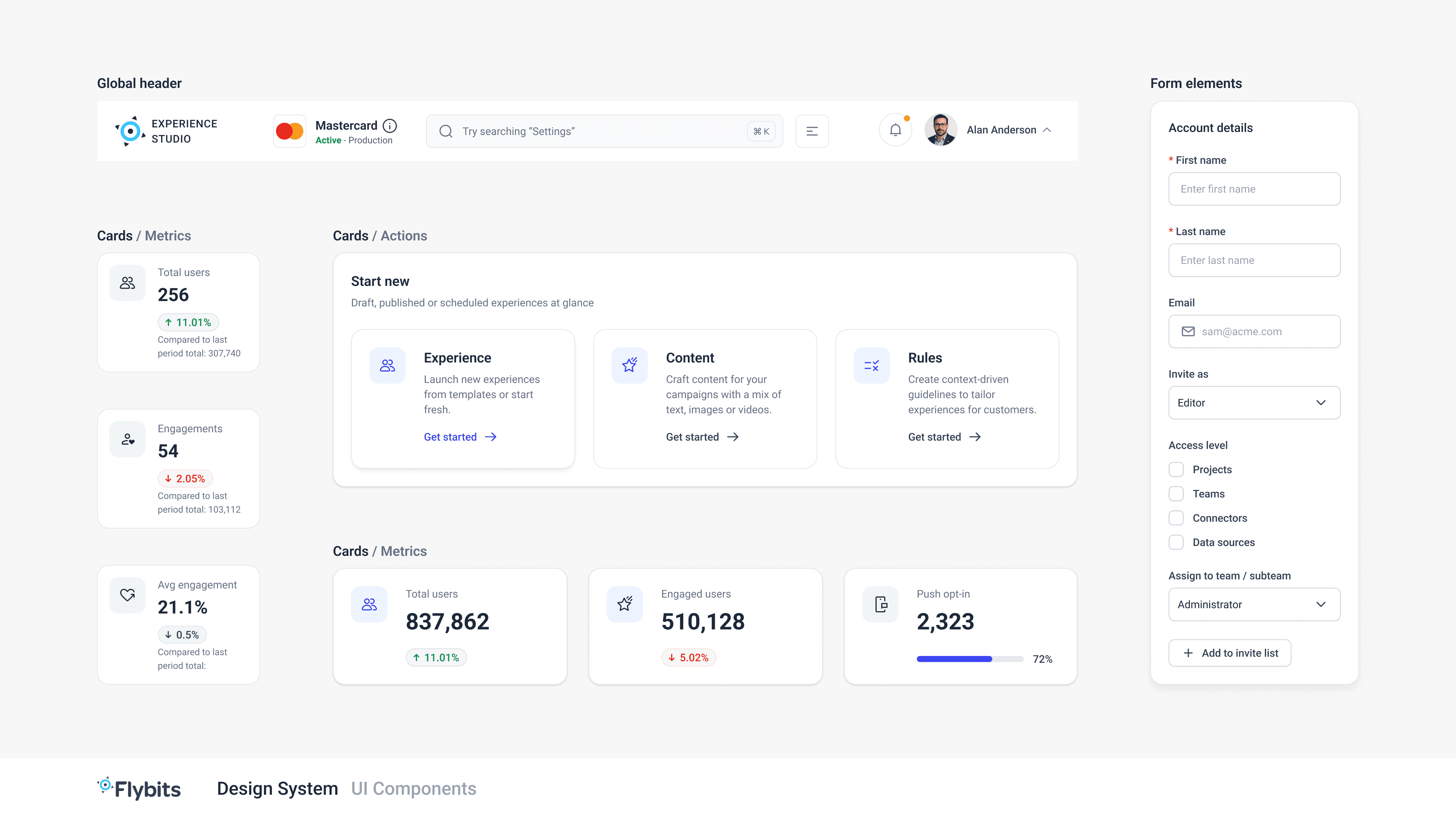
Newer card components and form elements

Grid system: 12-column grid, centred 1184px container, 28px gutters - 73px wide columns
Working on such a complex application required us to customize and refine our design thinking process. We attempted to adapt familiar methods by (1) basing our research with real-life scenarios, (2) generating ideas that were constrained to technical/business requirements, and (3) customizing our evaluation methods to uncover unmet customer needs and find the overlap with the product offering.
Personally, the project reinforced the value of over-communication and transparency during rapid delivery cycles. By bridging product, engineering, and design, I helped transform a complex platform into a cohesive, growth-enabling and revenue driving experience.
Taking on partial ownership of the Product development, by co-authoring user-stories and acceptance-criteria to help developers understand features and their value, was a great learning experience from a Product management perspective.