About the project
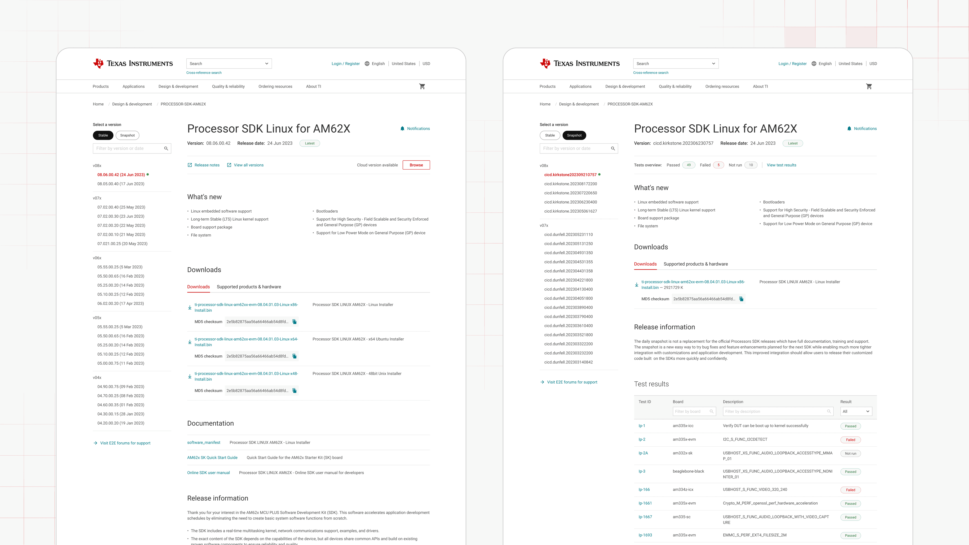
Texas Instruments' Newsroom website was previously hosted on Cision, a third-party platform that created a fragmented experience separated from the main TI.com site.
To streamline operations, UX and brand consistency, the newsroom needed to be integrated into TI.com, leveraging Adobe Experience Manger (AEM) for blog authoring and ingesting news feeds from PR Newswire.
Additionally, the existing newsroom used deprecated navigation, outdated components, resulting in an inconsistent user experience compared to the rest of TI.com.
Live MVP:
User problems
Content authors struggled with non-intuitive ways to create blog posts, and needed handholding for publishing or editing stories.
End users (customers, investors and journalists) found it problematic to navigate through the website and complex to use (filters etc).
Business problems
TI Corporate aimed to reduce the annual platform cost by transitioning from Cision to an in-house CMS system i.e. AEM
The existing workflow was slow, fragmented and cumbersome as it required asynchronous co-ordination to facilitate publishing of articles – this wasn't efficient or scalable.
Solution
We designed and launched the MVP newsroom platform integrated directly into TI.com powered by reusable components & templates in AEM. We approached it in the following ways:
Experience consistency: Required the integration of TI.com's global header, restructured sitemap and design system to craft a simple and seamless solution.
Authoring-first approach: We co-created components and standardized templates with an intuitive authoring interface, enabling non-technical users to create, dit and publish content independently.
Scaling architecture: Reusable content fragments and page modules that were repurposed in different sections; blogs, news, media resources.
Accessibility first: Applied ARIA labels, keyboard navigation, colour contrast guidelines and image standard across components.
Creating data-source: The MVP was scoped to core functionality and publishing workflows, paving way for data-insights driven design and functional refinements.
Role
Designer & Strategist
Responsibilities
- Authoring requirements
- Component specifications
- Design concept solution
- Design strategy
- Functional requirements
- Information architecture
- Technical specifications
Team
Back-end Developer, TI AEM
Creative director, UXD
Front-end developer, UXD
Product owner, TI Corporate
Project coordinator
Industry
E-commerce, Marketing
Project duration
2 months
Outcome and impact
Cost efficiency through $40K annual savings by retiring Cision platform.
Authoring efficiency through 80% ease-of-use AEM templates.
Validated UX through a System Usability Score (SUS) of 90.
Simplified content governance through scalable content models.
Accessibility first approach by achieving of WCAG 2.1 compliance.
MVP components
Content fragments that rendered based on context
Authoring experience in AEM
Newsroom landing
News releases and Blogs landing
Story pages
Media resources
Newsroom landing (Phase 2)
Blog story page (Phase 2)
Start small, validate fast: The project was rolled out as part of an MVP solution to assess early impact while informing priorities for Phase 2.
Designed for authoring as well as end-users: We designed something that helps authors to manage content at scale, not just easier for end-users to navigate through.
Driving efficiency through consistency: Targeting the quick-wins to achieve a better effort to impact ratio.
Frequent communication for alignment: Early and frequent collaboration with engineering and corporate helped understand everybody's challenges.
Systems thinking lens: We tried to look at the workflow through two distinct perspectives for authors and visitors.


